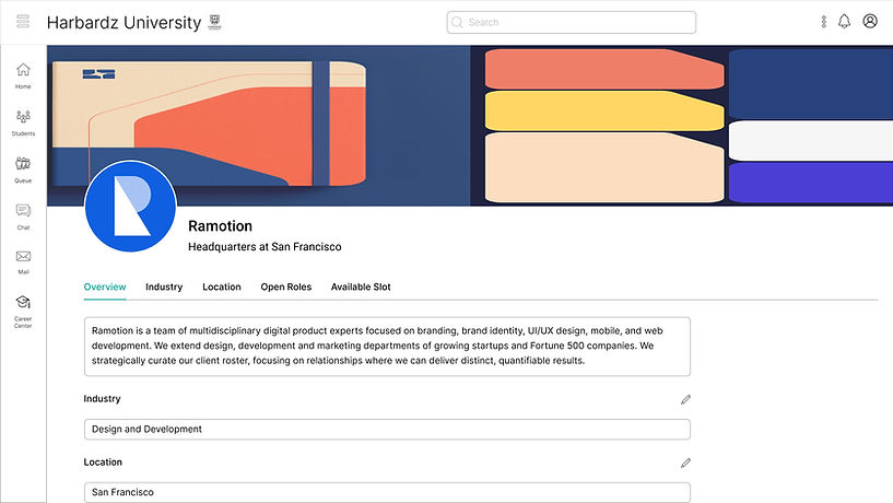
Harbardz Career Fair
Background
A B2B SaaS platform that brings the energy of in-person career fairs into a seamless digital experience
As part of Harbardz University’s digital transformation initiative, the institution set out to move all career fairs online to improve accessibility, efficiency, and student engagement.
I was tasked with designing an end-to-end desktop web application that replicated the energy and structure of an in-person fair while addressing its pain points—such as long queues, missed opportunities, and limited employer-student interaction.
The goal was to create an intuitive, immersive, and scalable platform that empowered employers to discover ideal candidates easily, while helping students navigate their career search with confidence.
Role
UX Designer
Responsibilities
Research, Wireframes
Tools
Figma, Zoom, AI Tools
Duration
1 week
Problem
In-person career fairs cause long wait times, limited access, and missed opportunities. Harbardz University needed a virtual platform to recreate real-world interactions while making the experience more inclusive, efficient, and user-friendly.
Design Goals
Shaping the Virtual Career Fair
The goal was to design a virtual career fair platform that replicates the in-person experience while improving accessibility and efficiency.
Replicate the in-person career fair experience while improving accessibility and efficiency
Create an intuitive, inclusive interface for all users
Enable seamless student–employer connections
Support smart candidate discovery with filters and AI recommendations
Reduce friction with calendar integration, live chat, and resume sharing
Ensure a personalized, human-centered experience at every touchpoint
Design Thinking
To create a user-centered and scalable solution, I followed the five stages of the Design Thinking framework:

01 Empathize
Uncovering Pain Points & Barriers
I researched user experiences through forums, student testimonials, and platforms like Handshake and Brazen. This revealed pain points such as long wait times, limited personal interaction, and accessibility challenges, highlighting both emotional and functional barriers that shaped the design direction.
02 Define
Translating Research into Insights
Research revealed key problems: students faced long waits, limited accessibility, and anxiety in public interactions, while employers struggled with poor candidate matching and time constraints. These insights shaped design goals around better discovery, interaction, and personalization.
User Persona
Meet our Key Users
To design a user-centered experience, I identified two primary personas:
-
a student seeking meaningful career opportunities
-
a recruiter aiming to efficiently discover top candidates.


Empathy Mapping
Seeing Through Users’ Eyes
I created empathy maps to understand users’ thoughts, feelings, and perspectives, ensuring the design reflected their point of view.
03 Ideate
Turning Challenges into Opportunities
I brainstormed solutions to replicate in-person benefits while addressing limitations, exploring smart filters, AI recommendations, appointment booking, and fallback chat. Sketching multiple flows helped prioritize a seamless, accessible experience for students and employers.

This made me wonder...
How might we design a virtual career fair that feels as personal and efficient as an in-person event, while removing barriers of time, access, and anxiety?
Task Flow
Streamlining Key Actions
I mapped user steps to design a clear, intuitive path that lets students and employers complete goals with minimal friction.

04 Design
From Principles to Prototypes
I applied Gestalt principles—proximity, similarity, and closure—to create an interface that feels intuitive, cohesive, and user-friendly.
Lo-fidelity Wireframes
Sketching the Structure
I sketched low-fidelity wireframes to quickly map structure and user flow, focusing on core problems and validating layouts before moving to high-fidelity design.


UI Wireframes
Shaping the Visual Experience
I translated wireframes into Figma, focusing on visual clarity, consistency, and user engagement.
Student Journey Screens

Employer Journey Screens

Reflections & Learnings
What was most challenging?
Designing a seamless dual experience for students and employers was the biggest challenge. Balancing their distinct needs—while keeping the employer journey efficient—required deep empathy, iteration, and trade-offs between UI clarity and complexity.
What would I improve with more time?
I’d run usability testing with students and recruiters to validate assumptions. Future improvements include AI-driven recommendations, stronger accessibility features, and a mobile-friendly version to broaden impact.


