

DealBadger
Background
A B2C platform for online auction specializing in customer returns and liquidation items from major retailers
DealBadger is a web-based auction platform that lets users search for items by location, place bids in real time, receive outbid alerts, and manage pickups—making local auctions more accessible and engaging.
Role
UX/UI Designer
Responsibilities
Research, Wireframes
Tools
Figma, Zoom
Duration
6 weeks
Problem
DealBadger’s web platform is slow, confusing, unorganized, with alignment issues, poor transitions, and excessive scrolling, leading to a frustrating user experience.
"Using DealBadger is such a pain—pages load slowly, it’s hard to find what I want, and I end up scrolling forever just to place a bid."
- Dealbadger Customer
Solution
Create an app with a clean, user-friendly UI, clear navigation, and organized layout to offer a seamless, efficient auction experience.
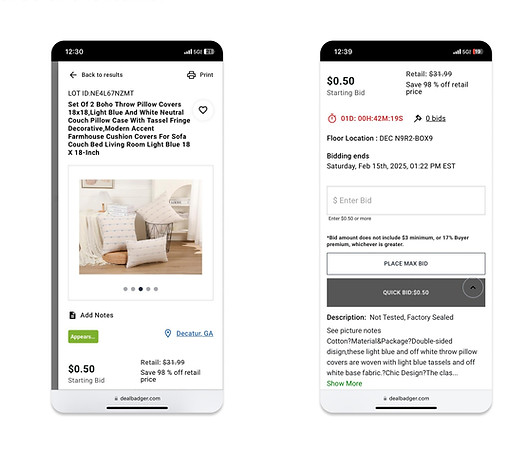
Usability Issues
I analysed the interface and identified areas that can be improved.
Homepage Usability Challenges
-
Floating Elements: A random arrow disrupts navigation and confuses users.
-
Excessive Scrolling: Infinite scroll makes finding content difficult.
-
Large Images: Oversized visuals clutter the layout and hinder browsing.
-
Text Cutoff: Key text is cut off or missing, reducing readability.
Excessive Scrolling
01
Floating Elements
02
Text Cutoff
04
Large Images
03


Disorganized
Layout
Font & Hierarchy Problems
Missing
Descriptions
Issues Impacting Product Discovery
Disorganized Layout: Inconsistent positioning of text and images creates confusion.
Font & Hierarchy Problems: Inconsistent fonts and unclear hierarchy hinder information flow.
Missing Descriptions: Lack of detailed product information makes it hard to assess items.

User Research
Understanding User Behaviors & Needs
I conducted a survey across age groups to understand online shopping behaviors, challenges, preferences, and comfort with the web platform.
While one day standing in a queue to pick up my products, I noticed other customers struggling, which inspired me to take up this project and talk to users directly in the queue.
User Persona
Defining Our Core Shoppers
I synthesized interview insights into personas capturing lifestyle, habits, and frustrations, helping align features with real user needs.

DECISIVE FACTORS
- Price difference
- Condition of the product
- How old is it
- Delivery location
- Urgency of the product
- Parts check
How Might We(HMW)
Turning Insights into Actionable Questions
I reframed key user insights into How Might We questions, turning challenges into opportunities for design solutions.
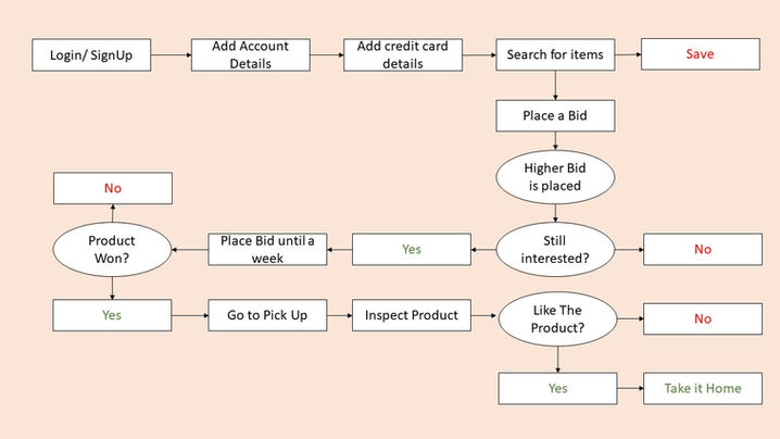
Task Flow
Designing the Auction Experience
I mapped the task flow for bidding in DealBadger, starting with users logging in or creating an account and adding payment details. They can then search for auction items by location, place bids, and receive notifications if they’re outbid, with a countdown timer showing time left until the auction closes.
Once the auction ends, users are notified whether they’ve won or lost. Winners have one week to collect items, with the option to inspect them at pickup. If the product is damaged, they can return it and choose either a refund or wallet points—ensuring a smooth and user-friendly end-to-end experience.
Wireframes
Laying Out Core Functionality
I created wireframes to map the platform’s structure and user flow, focusing on core functionality and layout without visual distractions.


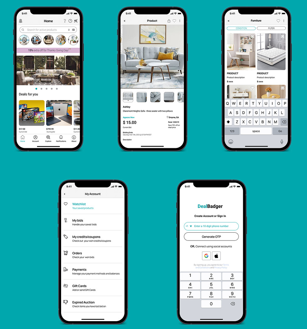
UI Design
Refining the Visual Language
In the UI design, I simplified layouts, reduced colors and fonts, clarified hierarchy, and used spacing and minimal color to create a clean, user-friendly interface.
Prototype
Refining the Visual Language


I built a prototype to test flow, transitions, and interactions, ensuring the layout and navigation aligned with the intended user experience.
Reflections & Learnings
Design Lessons & Growth
Through DealBadger, I learned that understanding real user pain points and iterating thoughtfully can turn frustration into seamless, satisfying experiences.
Working on DealBadger deepened my understanding of user-centered design and the importance of continuous iteration. User feedback, such as long waiting times for item collection, revealed the need for pickup time slot selection, which improved convenience. I also learned the value of clear communication, as product condition discrepancies highlighted the need for better product validation before listing items to build trust.
Another key takeaway was the importance of empathy and problem-solving. Addressing issues like missing parts and the lack of delivery options helped refine the platform's functionality for a wider base. This experience reinforced the need to gather feedback regularly and iterate to improve the overall user experience.