
Local Grown Salads
In a hurry? Start here !
Problem
The Inspector Home Screen was outdated and inconsistent with other LGS dashboards, making active alerts hard to scan and slowing inspectors from identifying what needed attention first.
Insight
The main issue wasn’t missing data. It was missing structure.
Inspectors need “what’s urgent” first, then a quick path to details.
Impact
Created an urgency-first dashboard that made alerts easier to scan, prioritize, and act on.
After approval, the pattern was adopted across teams across the organization.
Want the details? Here you go!
Background
A B2B AgriTech platform dashboard for inspectors to monitor crop health, manage alerts, and ensure consistency across LGS operations.
Local Grown Salads (LGS) is an AgriTech company that runs a proprietary EcoSystem for sustainable indoor farming, powered by AI and IoT sensors. Each team has dedicated dashboards to manage their work.
For this project, I redesigned the Inspector team’s Home Screen, the main hub inspectors use to monitor alerts, incubators, and vertical acres, ensuring clarity, consistency, and alignment with the new LGS design system.
Role
UX Designer
Responsibilities
Research, Wireframes
Team
UX , Inspectors
Duration
12 weeks
Problem
The Inspector team at Local Grown Salads used an outdated home screen dashboard that lacked consistency with other teams’ dashboards and did not fully support the inspectors’ needs.
Inconsistent design across different team dashboards
Critical features were either missing or poorly structured
Users had to jump without a clear hub
Design Goals
Driving Consistency Across LGS Dashboards
As a newly onboarded UX team, our first major task was to establish a unified design system for LGS, where I led the redesign of the Inspector Dashboard.
Consistency
Unify the Inspector Dashboard with the LGS-wide design system, ensuring a seamless experience across all teams.
Guidelines
Leverage LGS brand standards to create visuals that are cohesive, accessible, and aligned with the company’s identity.
Redesign
Transform the Inspector Home Screen into a clear, efficient hub for active alerts, sensor data and harvest data.
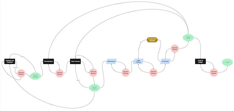
Design Process Introduced
Building a Scalable Design Process
In addition to redesigning the dashboard, I introduced a more structured design process that improved alignment, encouraged iteration, and supported more consistent decision-making across teams.
Existing Design
Where the Inspector Dashboard Fell Short
The Inspector team’s old home screen dashboard at LGS was outdated and inconsistent with other team dashboards, making it difficult to use.
In particular, Active Alerts were displayed in a plain table format that was cluttered and hard to scan. Inspectors couldn’t quickly identify what went wrong or which crops needed immediate attention, which slowed their ability to act promptly.


Research
What Inspectors Asked For
I used a structured feature intake form to capture Inspector team needs. This gave me a clear baseline of goals, entry points, next steps, and desired features, which I later translated into Kano cards for prioritization.
Who will use this screen?
Inspector
What should this screen help the user do?
It should be the Main hub
What happens right before the user comes to this screen?
Login
What happens right after they're done using the screen?
Users will view detailed information of the 3 sub sections
List all the features you want on this screen.
Details of Received Alerts, Generated Alerts & Recent Alerts
Prioritisation Frameworks
Deciding What Matters Most
-
Kano Model: Distinguished Must-Haves vs. Delighters.
-
MoSCoW Method: Prioritized essential features (Language, Profile, Summary, View All Alerts) for MVP.


User Journey Mapping

How Inspectors Navigate
Each user journey captured the journey point, entry point, step-by-step actions, confirmations, resulting output, and whether it led to another screen.
Design Iterations
Testing What Works (and What Doesn’t)
-
Explored 4–6 versions of the home screen.
-
Tested summary vs full-table approaches, layout hierarchy, and navigation placement.
-
Didn’t work (e.g., couldnt have all the information, cluttered table, unable to show urgency etc).


Brand Guidelines


New Design System


Finalized Solution
Refined Dashboard Design
I redesigned the Inspector Home Screen with a card-based layout to keep information clear and scannable.
-
The dashboard displays 4 active alerts by default, with a right-arrow navigation to view up to 12 alerts.
-
For a complete list, inspectors can select the “View All Alerts” option.
-
Urgency levels are color-coded (urgent, high, medium, low, informational) for quick recognition.
-
Alerts are sorted by most recent, ensuring inspectors see the latest issues first.
.jpg)
Reflections & Learnings
Lessons from My First Client Project
This was my first project with a real client, giving me valuable experience in collaborating directly with both stakeholders and my UX team. I learned how to facilitate discussions, gather feedback, and translate challenges into design opportunities.
Leading the redesign for the Inspector team, I held multiple meetings to understand their pain points with the old table-based design, which made active alerts less impactful. Through brainstorming sessions, brand guideline alignment, and design system exploration, I developed a card-based solution that was well-received. Inspectors appreciated how, at a quick glance, they could see which crop had issues and its urgency level, making the dashboard more intuitive and actionable.